Global Design System with Themes


Abbott Laboratories, a global leader in healthcare and medical devices, requested a scalable and adaptable design system to support its vast portfolio of digital products. With a presence in over 160 countries and a diverse range of healthcare solutions — from diagnostics and medical devices to pharmaceuticals and nutrition — Abbott needed a system that could accommodate distinct brand standards across its product lines while reducing the need for custom development. Together, we created a flexible, reusable framework that made it easy for teams to build consistent, high-quality user experiences without having to start from scratch every time.
Abbott’s digital design process was fragmented, with each product team designing and developing solutions independently. This led to inconsistencies in UI components, redundant design efforts, and a lack of efficiency in maintaining accessibility and regulatory compliance. Teams spent excessive time rebuilding similar solutions, slowing down production and increasing the risk of non-compliance across global markets.
Problem Statement
Fragmented design processes led to inconsistent UI patterns across products, increasing development overhead and technical debt while creating accessibility and compliance risks in 160+ markets.
Goals
We defined key objectives for the new design system:
Standardize UI Components
Create a shared library to eliminate inconsistencies in structure, usage, and interactions across digital products.
Reduce Overhead
Minimize redundant work by enabling teams to reuse components instead of rebuilding solutions for each project.
Flexible Theming
Provide tools for product teams to apply custom branding without requiring custom development.
Unify Design Workflows
Streamline fragmented design processes to create a more consistent approach across teams and products.
Accessibility and Compliance
Establish a structured review process to meet global accessibility standards and regulatory requirements.
A Global Design System
To address these challenges, I worked with Abbott’s UX leadership to explore whether a single component-based design system could unify its digital products. We audited existing experiences to identify recurring design elements and developed a taxonomy and naming convention for components — a flat structure was preferred to make it easy for designers to find a particular component in the library. From there, we rebuilt each component into a flexible, reusable module that could be easily adapted to different brand requirements.
The new design system was built around three core principles:
Scalability
The system would support hundreds of digital products across Abbott’s global portfolio.
Customization
Each sub-brand within Abbott would be able to maintain a unique identity while following a unified design language.
Governance
A centralized governance would maintain quality and consistency, and drive adoption across product teams.
This approach allowed design teams to import global components into product-specific libraries, where they could apply custom fonts, colors, and styles without modifying the core structure. Any updates to the global library were pushed universally, enabling teams to adopt changes without affecting their styling.
Button component with variants
Select list (dropdown button) component with variants
Text input components with variants
Card component with variants
Anatomy of a Component
We utilized a layered architecture for components to ensure consistent structure while allowing custom styling and theming. Structural layers were named according to their default purpose, although designers could apply any styles as needed to accommodate their brand guidelines without requiring custom development. Additional layers and/or other nested components were added in more complex components.
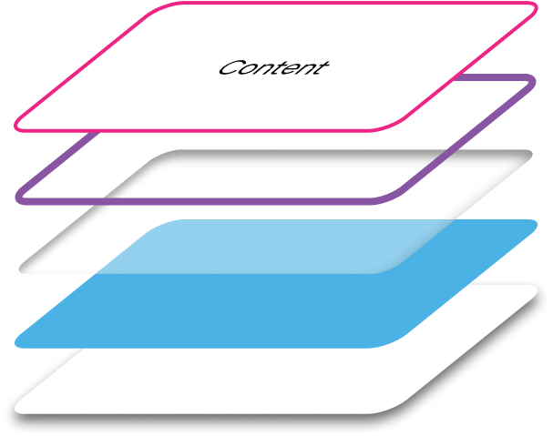
 Content Layer: Houses text elements or slot components for dynamic content.
 Border Layer: Optional styling for strokes, outlines, and glowing edges, adapting to UI states and accessibility needs.
 Inner Shadow Layer: Used for state changes, focus indicators, and inset effects.
 Fill Layer: Defines the component’s shape, color, and background styling, supporting theme-based overrides.
 Shadow Layer: Provides elevation and emphasis through blur effects, drop shadows, and overlays.
This structure kept components flexible, allowing designers to modify layers as needed while maintaining the integrity of the system.
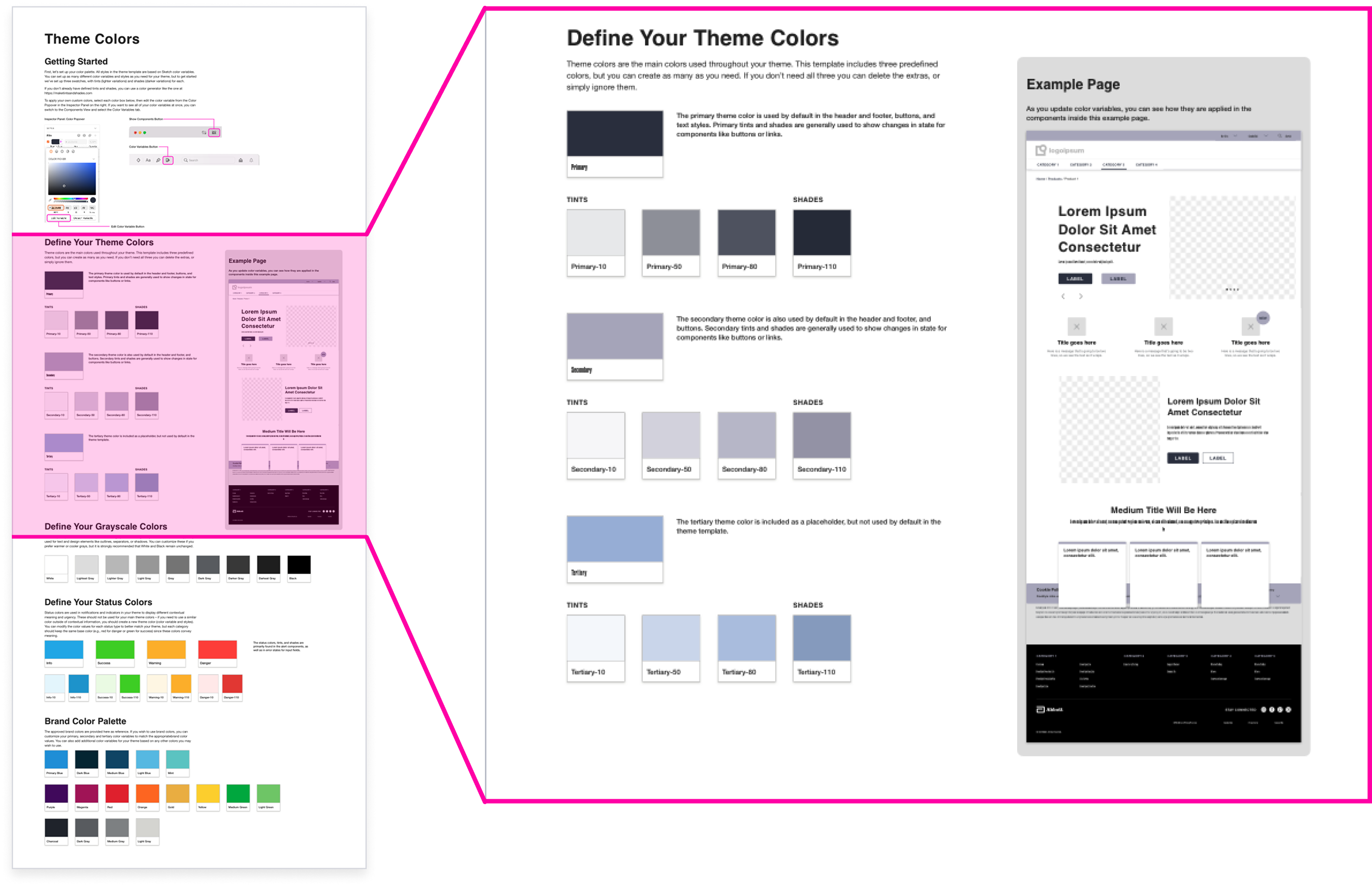
Support for Themes
To support customization without requiring custom development, we introduced variables and styles as part of a new theming model.
Customizable Themes
Tokens, variables, and styles to define core attributes like colors, typography, spacing, and elevations.
Component-Specific Overrides
Granular control over UI elements to customize according to product-specific brand guidelines.
Built-In Accessibility
WCAG-compliant global components, and documentation on accessibility standards for theme creators.
By separating visual styling from component structure, the system allowed teams to customize branding while maintaining efficiency in development.
Sketch color styles based on design tokens
Sketch type styles based on design tokens
An Update, a Curveball, and Panic
In the middle of the project, after rebuilding hundreds of components to support tokens and styles from external theme files, the worst thing that could happen…happened. Sketch released an update, and just like that, the new design system broke. None of the components reflected theme styles anymore – not good for a system built entirely around the concept of custom-themed components.
Before we began I had demoed a proof of concept to Abbott’s design team, so I knew the approach had worked before the update. After some frantic calls to Sketch support, I learned they were aware of the bug and hoped to have a fix “soon”. I continued on, rebuilding design components and waiting for good news in the form of another software update. Finally, after weeks of anticipation, Sketch released a new update including a fix for this issue, and everything worked as expected again — much to my relief and the client’s delight.
Phased Development
To keep the project moving quickly, I worked closely with Abbott’s developers to adopt an iterative workflow. Instead of waiting for the entire design system to be finalized before handoff, we divided the component library into structured groups. I handed off design components after the completion of each group, so while development was underway for one set, I could continue designing the next batch of components.
This phased approach allowed for continuous progress and faster implementation. Regular check-ins and feedback loops between design and engineering ensured that design intent was preserved in live components, and any technical constraints were addressed early.
Governance & Extensibility
To ensure long-term success, we worked with Abbott’s existing UX governance team to refine processes for maintaining quality and supporting innovation:
Design System Documentation
InVision DSM became the single source of truth for component usage, interaction patterns, and best practices. Storybook housed live components (complete with interactive demos), code samples, and developer documentation.
Regular Audits and Updates
The governance team continually evaluated the system to address gaps, incorporate new UI patterns, and ensure ongoing alignment with business and user needs.
Cross-Functional Collaboration
The governance team assessed whether new component and enhancement requests should be incorporated into the global system or remain product-specific, ad-hoc components.
Training and Support
Onboarding materials and dedicated support channels helped teams integrate the design system into their workflows efficiently.
Automating Themes
To simplify creating new themes, we developed an automated onboarding process that let designers apply brand styles without needing manual updates.
A dynamic start page in Sketch allowed designers to define color values and styles inline, instantly reflecting changes in a mock page template. While further customizations could be made at the component level, this approach enabled teams to set up branded libraries quickly and efficiently.
Generating Code
Once we had streamlined the theme creation process, we focused on making theme delivery and deployment easier. Working with Abbott’s design system development team, we built a theme builder application inside Storybook.
Product teams could apply their brand styles to live components within the tool and generate a complete CSS file for developers. Themes could be saved as presets, allowing teams to iterate quickly and gain stakeholder approval before implementation. Future enhancements planned for the system included integrating the theme builder directly with Abbott’s CMS to automate theme deployment further.
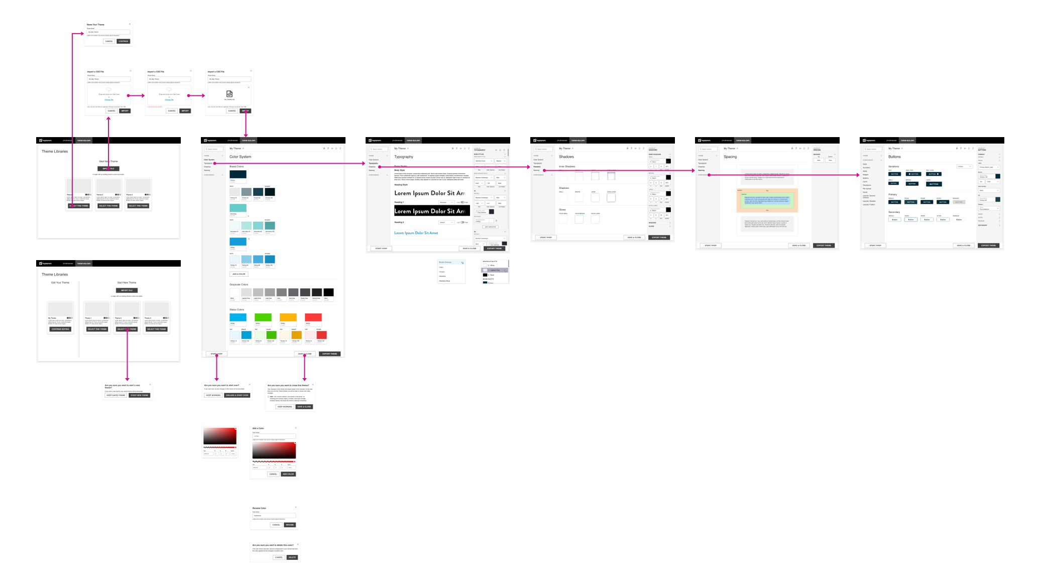
Theme Builder Start Screen (with saved theme and theme presets)
The color system allowed for custom brand colors, neutrals, and status colors.
The typography system allowed multiple styles and granular control, including values for light and dark mode.
The elevation system allowed for levels of inner and outer shadows, and a set for defining glows (focus rings).
The spacing system provided a consistent set of margins and padding, including on-the-fly previews.
Impact
The design system transformed Abbott's digital workflow. The automated onboarding process reduced initial theme setup from hours of manual component customization to only minutes for most product teams. Product teams could now launch branded experiences using pre-built, accessible components instead of rebuilding UI patterns for each project. The system was adopted across Abbott's global portfolio, supporting hundreds of digital products in over 160 countries, with the theme builder becoming the standard tool for deploying new branded experiences.