Symptom Checker & Telehealth App


BayCare, a regional healthcare network with 14 hospitals and hundreds of care locations across west central Florida, faced a common challenge: patients frequently visited the ER for conditions that could be treated more efficiently and affordably elsewhere. This led to unnecessary financial burden for patients, increased uncompensated care costs for BayCare, and longer ER wait times for those with true emergencies. To address this, they wanted to consolidate multiple standalone apps into a single platform that could guide patients to appropriate care options and improve the healthcare experience for everyone.
BayCare had a small product team and relied on our agency to help shape their digital platform. As lead designer on this multi-year engagement, I was responsible for all UX/UI design and user research while collaborating with their product team on strategy to not only design a better experience but also help lay the framework for an extensible platform.
Problem Statement
Patients often struggled to assess symptoms accurately, leading to confusion, delays in seeking care, and overcrowded ERs. Improving symptom assessment and guiding patients to the right level of care was essential to reducing patient stress and optimizing healthcare resources.
Goals
Before diving into design, we needed to clearly define what success would look like for both the business and users, while working within real-world constraints. To meet the requested timeline and accommodate a lengthy legal approval process, we focused the initial MVP launch on three key objectives:
Reduce ER Wait Times
Guide patients to the appropriate care options and lower the number of emergent hospital visits.
Provide Treatment Options
Educate users on appropriate means of treatment for their symptoms (taking care not to make any official medical diagnosis).
Build a Foundation
Combine features from multiple apps into a single platform that can scale as new features are added.
MVP Scope & App Architecture
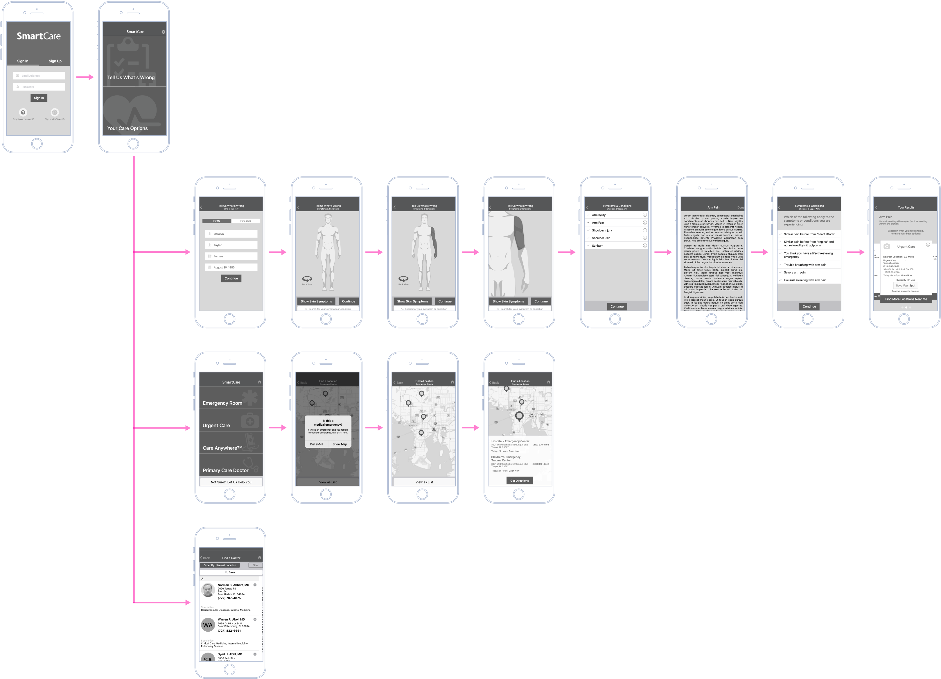
The client initially envisioned a symptom checker tool that would allow users to select affected body parts from an interactive diagram and receive care recommendations. They provided wireframes of key screens but had not conducted user research or tested the viability of their ideas. Due to a tight timeline and the lack of legal approval for telehealth at launch, I had to prioritize features for the MVP while ensuring the app could grow into its full vision over time.
We decided to launch with:
- The Symptom Checker: A body diagram (or “homunculus”) allowing users to select symptoms and receive care recommendations.
- Care Options: Maps with wait times and navigation to nearby ER and urgent care centers, and an in-network directory of Primary Care Physicians (PCPs).
Telehealth integration and additional features were planned for later releases once regulatory concerns were addressed.
Wireframing & Prototyping
With the MVP features and flows defined, I drafted wireframes, using the client’s concept as a starting point but refining it for usability and scalability.
To help stakeholders visualize the app’s functionality before development, I built an interactive prototype in Sketch, allowing them to test key interactions and provide feedback. This early validation helped identify potential friction points before high-fidelity design work began.
UI & Visual Design
With minor tweaks to the wireframes based on insights from the prototype, I moved into UI design. The client’s strict brand guidelines required a minimal color palette, primarily relying on two core colors. However, to improve clarity and usability, I introduced color-coded care options — red for ER, yellow for urgent care, green for PCPs, and blue for telehealth — to help users quickly distinguish between treatment levels.
v1 Home Screen
Body Diagram with left arm selected
Body Diagram (zoomed) with left forearm selected
Symptom selection
Specifying severity
The app provides care options based on the user's symptoms and severity
Users can choose their own care options directly
Map view showing the closest hospitals/emergency rooms
Map view showing the closest urgent care centers
Directory of BayCare primary care physicians
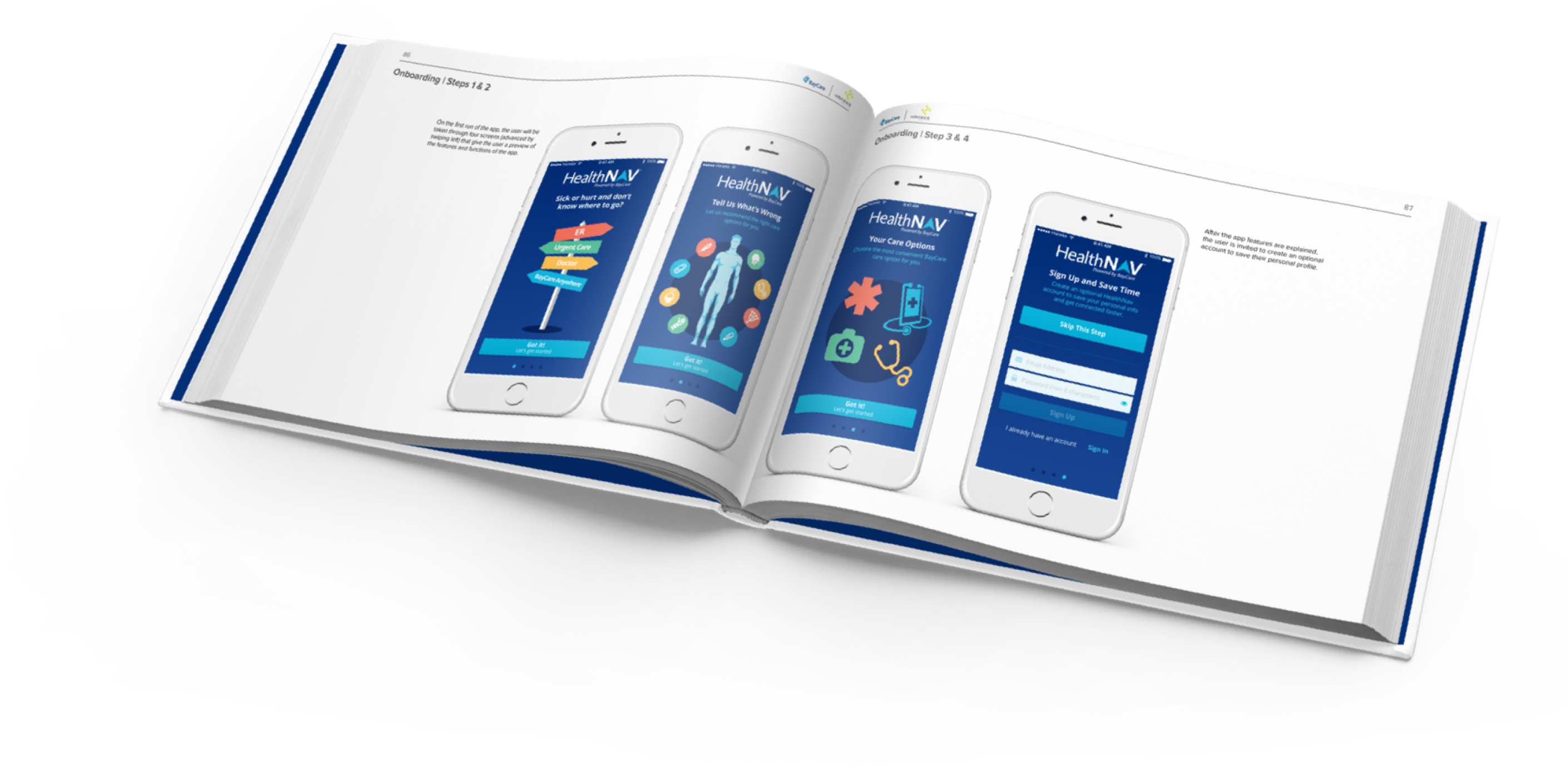
As a unique leave-behind, our agency provided clients with a hardcover, printed style guide to commemorate the design phase. This book included key UX artifacts — research findings, user flows, wireframes, and high-fidelity designs — serving as both a reference document and a polished, professional showcase of the work. While developers primarily relied on digital design files, the printed book was a thoughtful way to document the project and reinforce the client’s investment in a well-crafted user experience.
The app was designed to support iOS and Android across both mobile and tablet form factors, and we also launched a version as a responsive web application so underserved users could still access the platform even without a smartphone or tablet.
Post-Launch Feedback & Challenges
After launch, we planned a series of updates to improve usability and expand functionality. Since formal user testing wasn’t an option, I gathered insights from:
- User reviews and app store feedback
- Informal testing among the internal team
- Direct observations from healthcare staff
One major challenge was discoverability — some users struggled to understand how to interact with the symptom checker. To address this, we introduced:
- Onboarding screens calling out key features.
- Instructional overlays demonstrating how to interact with the homunculus.
This helped reduce confusion and improve engagement with the symptom checker tool.
Onboarding: Find Care Options
Onboarding: Symptom Checker
Onboarding: Gestures
Telehealth
Our next major update introduced in-app virtual doctor visits. However, the third-party telehealth platform had usability limitations, requiring some design concessions. We were unable to launch the feature with a single sign-on (SSO), so users would have to create and maintain two separate accounts — one for the app and one for telehealth. SSO integration was backlogged for a future release.
Single Sign-On wasn't available at launch, so telehealth required a separate account
Profiles for each family member made setting up appointments faster and easier
Patients could see doctors' availability and select a provider
Confirmation screen before appointment
Saved payment methods
Payment confirmation
Telehealth sessions showed a split view of doctor and patient
A summary screen with ratings appeared after the call
UI & Feature Iteration
For version 3.0, we focused on refining the experience rather than adding new features, improving the overall UI and usability:
- Lighter, more approachable color schemes to make the app feel more inviting.
- A new tab bar for navigating the app, based on native iOS and Android patterns.
- Replacing text-heavy screens with visual metaphors, for example: avatar-based selection menus (including playful “Unmonsters” characters from a related children’s game) instead of text-based list views.
A new profile selector using avatars
An updated body diagram
The new body diagram zooms independently of the background, giving the appearance of 3D space
New recommendation cards for ER, with more detail
New recommendation cards for Urgent Care, with more detail
Updated map view with filtering for care types
BayCare Anywhere (telehealth) selector
BayCare Anywhere profile selector with avatars
Updated doctor selection
Updated visit confirmation
Updated edit payment method
Updated visit summary
We also began adding micro-interactions and animations to create a smoother, more intuitive experience. These helped draw user attention to key interactions and made gesture-based navigation more intuitive. Animated onboarding screens replaced static versions to provide better explanations of key features.
Animated body diagram onboarding showed body regions highlighting and zooming
Animated pins dropping onto a map
Animated device showing a telehealth visit
Animated icons explaining touch gestures
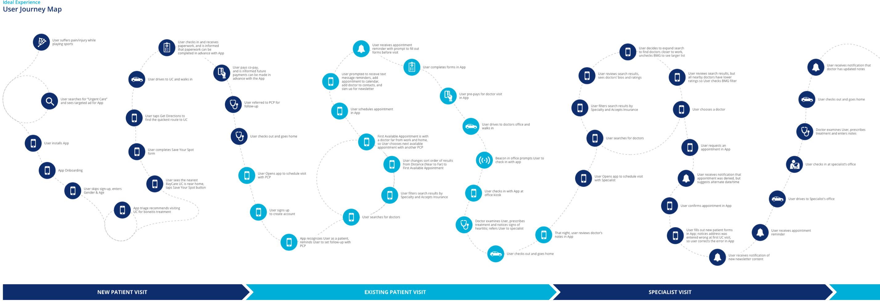
As the app’s core features began proving successful, we worked with the client’s product team to map out an idealized patient journey with the app becoming a central part of the healthcare experience. Beyond symptom checking and telehealth visits, we envisioned a future where the platform could support every stage of a patient’s care — from helping users find doctors and treatment options to making informed decisions about care, the app could serve as a digital hub for users’ health needs.
Looking ahead, we explored ways to integrate the app more deeply into in-person visits. Patients could receive and complete intake and insurance forms ahead of time. The app could utilize location services and beacons to check in patients automatically upon arrival, make payments, and even access doctor’s notes and reports after their appointment. This roadmap provided a clear long-term vision for how the app could evolve into an essential healthcare tool, reducing administrative friction and improving the overall patient experience.
Impact
The app successfully launched across iOS, Android, and web platforms, giving BayCare patients a centralized tool for navigating their care options. The project earned recognition with a Silver Indigo Design Award for Mobile App Design (2018), validating the user-centered approach and interface design.
Though I didn't have access to post-launch analytics, the multi-year engagement and continued investment in new features indicated the app was meeting BayCare's objectives. The project demonstrated how thoughtful UX design — grounded in user research and strategic product thinking — can help healthcare organizations improve patient care while managing operational constraints.