Thyroid Cancer Diagnosis App


This native mobile app was designed to help patients with thyroid nodules understand their condition and treatment options. By capturing demographic information, thyroid hormone levels, ultrasound findings, biopsy results, symptoms, and genetic data, the app would provide personalized assessments and recommendations and help patients determine whether nodules require biopsy, additional testing, endocrinologist evaluation, or surgery.
The client, who had previously published a successful app for diagnosing parathyroid disease, wanted to bring the same level of clarity and engagement to thyroid cancer diagnosis. I worked on early-stage visual design concepts for this project, exploring how to make complex medical diagnostics feel accessible and engaging through thoughtful UI design.
Visual Design Concepts
I contributed initial visual design concepts for the results presentation. The client's parathyroid app had used an animated gauge with a moving needle to display calcium level recommendations, and patient feedback was overwhelmingly positive. They wanted a similar treatment for this app, but I saw an opportunity to push the design forward. Rather than reusing the physical gauge metaphor, I drew inspiration from futuristic UI in science fiction to envision a more advanced, engaging way to present complex medical data.
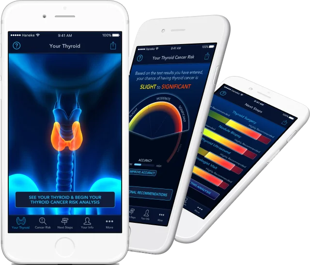
The "Holographic" Thyroid
The centerpiece was a 3D thyroid visualization that mimicked a holographic representation of the patient's anatomy, showing their specific nodules in context. This gave patients a clear, spatial understanding of their condition rather than abstract numbers.
Illuminated Data Displays
Results and diagnostic information were presented in lighted, glassy panels with bright accent colors—creating a clean, modern aesthetic that felt both high-tech and approachable. All graphs featured smooth animations: ranges would start as single lines and expand into pie charts or bar graphs, making the data reveal feel dynamic and easier to follow.
"Holographic" 3D representation of the user's thyroid
Thyroid cancer risk gauge
Next steps and risk estimation
User's medical info sharing progress